
About this component
A premium animated page loader that creates an elegant loading experience with synchronized logo reveal, progress tracking, and smooth transitions.
Features:
Opacity-based logo fill that works with any logo color
Synchronized progress bar and logo animations
Realistic loading stops at random intervals
Character-by-character text animation
Fully customizable with native Framer controls
Auto-cleanup after animation (no interaction blocking)
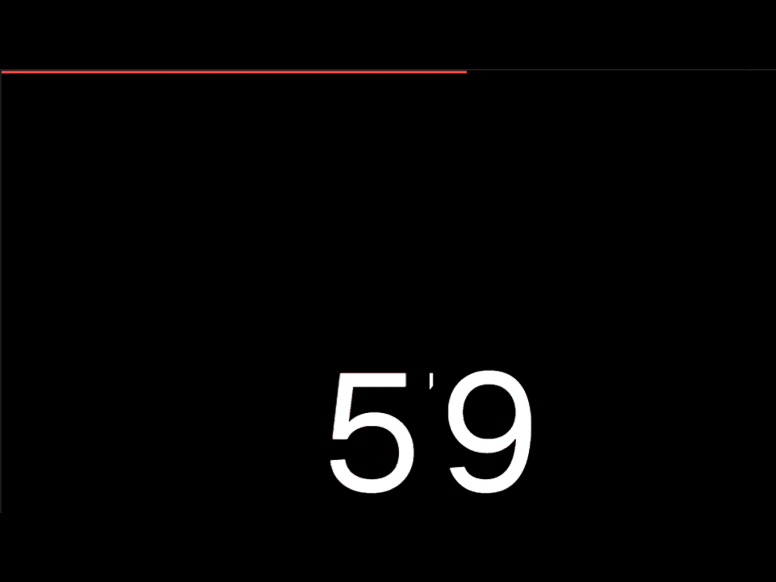
Preview:
What you get:
Production-ready Framer component
No code files needed - property controls only
Complete documentation included
Setup:
Step 1: Add component to your project
Add from Framer Marketplace or copy from remixed project.
Step 2: Place at root level
CRITICAL: The component MUST be at the root level (not inside any frames).
Correct placement:
Logo Reveal Loader (at root level)
Main Content Frame (sibling, not parent)
Step 3: Upload logo
Select component
Click Logo control in Properties
Upload your logo (SVG recommended)
Step 4: Customize
Key settings in Properties panel:
Logo Width: 100-800px (default: 300px)
Logo Start Opacity: How faded initially (default: 30%)
Logo End Opacity: Full visibility (default: 100%)
Background: Overlay color
Progress Bar Color: Should contrast with background
Text 1 & Text 2: Loading messages
Duration: Total animation time (recommended: 4-5s)
Canvas Overflow Notice:
The loader will appear to overflow your canvas - this is normal!
The component uses position: fixed which causes visual overflow in the Framer editor. This does NOT affect preview or live sites.
How it works:
Loading (0-100%): Logo fills, progress grows, text appears
Text switch (50%): First text fades out, second fades in
Completion (100%): Brief hold pause
Exit: Background slides up, logo fades out
Troubleshooting:
Loader blocks page after animation
Verify component is at root level (not inside frames).
Logo doesn't fill properly
Check Logo End Opacity is 100% and logo has good contrast at 30% opacity.
Progress bar not visible
Increase Progress Bar Height (4-6px) and check color contrast.
Text not visible
Check text color contrasts with background color.
Best Practices:
Do:
Place at root level
Keep duration under 6 seconds
Use strong color contrast
Keep text short (2-3 words)
Test on mobile devices
Don't:
Nest inside frames
Use low-contrast colors
Make animation longer than 6 seconds
Forget to test in preview
Final Checklist
Component at root level ✓
Logo uploaded ✓
Colors customized ✓
Text customized ✓
Duration set (4-5s) ✓
Tested in preview ✓
component by
Omakase Design
Logo Fill Preloader
A premium animated page loader component that creates an elegant loading experience with synchronized logo reveal, progress tracking, and smooth transitions.
01
EASY DROP-IN SETUP
02
SMART PROPERTIES & CONTROLS
03
RESPONSIVE BY DEFAULT
04
CLEAN AUTO-LAYOUT STRUCTURE
05
VARIANTS & STATES INCLUDED
06
PERFORMANCE-OPTIMIZED
07
REUSABLE ACROSS UNLIMITED PROJECTS
Last Updated
Need help or support?
