Every SaaS website design guide assumes you have a design team, a CRO consultant, and 8 weeks.
This one assumes you have a Framer account, a template, and a weekend.
I'm going to break down what three of the best SaaS sites on the internet, Linear, Notion, and Loom, get right about conversion. Then show those same patterns working at startup scale with Wispr Flow and Superwhisper. Then walk you through building your own version in Framer this weekend, using a template as your base.
Theory to live site. 48 hours.
Key Takeaways
The 3 conversion levers that separate SaaS sites converting at 0.8% from those at 3%+ (clarity, proof, friction)
What Linear's homepage does in the first 5 seconds that 90% of SaaS sites fail at
How Notion layers social proof to build trust at every scroll depth
Why Loom's "product as demo" approach kills friction better than any CTA button
A phase-by-phase weekend build plan using a Framer template as your base
The $49 vs. $15K decision: when a template is exactly right, and when it isn't
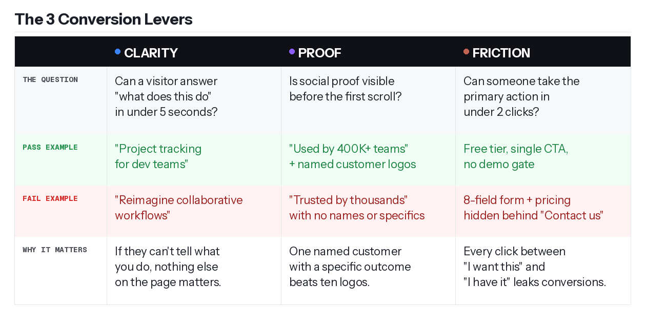
The Only 3 Things That Matter: Clarity, Proof, Friction
Before I break down the examples, here's the scoring lens I use to audit any SaaS homepage. Three questions. You should be able to answer each in under 10 seconds.
Clarity: Can a cold visitor answer "what does this do and is it for me" in under 5 seconds? If they can't, nothing else on the page matters.
Proof: Is social proof visible before the first scroll? Not buried below the fold, actually visible. Named people with specific outcomes.
Friction: Can someone take the primary action in under 2 clicks? If there's an 8-field form, a pricing gate, or a confusing nav between "I want this" and "I have it," you're leaking conversions.
Every section that follows grades an example through this lens. Use it on your own site when you're done reading.
Steal These Patterns from Linear, Notion, and Loom
Three sites. Three levers. One pattern each.
Linear: Clarity in 5 Seconds
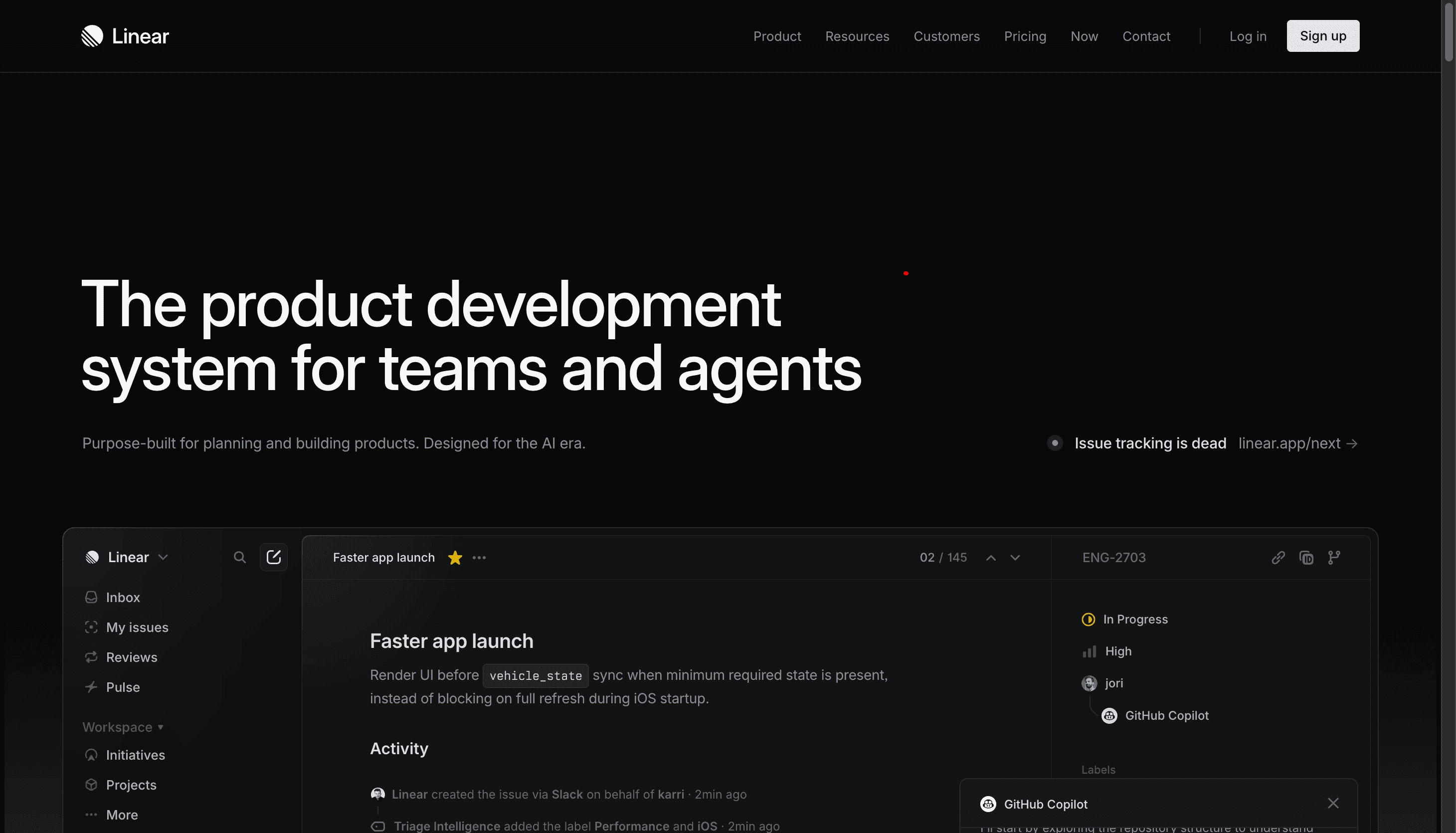
Go to linear.app. The headline is "The product development system for teams and agents." You know exactly what it is, who it's for, and what problem it solves before you've scrolled an inch.
That's the whole game.
Clarity check: Linear doesn't explain what project management is. It assumes you already know. What it does instead is show you, immediately in the hero, real product UI. Not illustrations, not abstract shapes, not a cartoon of people collaborating. Actual screenshots of the product working. A single CTA to sign up. No competing options pulling your attention sideways.
Proof check: Named customer logos and case studies, not a generic "Trusted by thousands of teams" claim.
Friction check: Free to start, product visible immediately, no demo gate between you and understanding what you're buying.
The pattern to steal: lead with a headline that eliminates confusion, show the product instead of a drawing of the product, and give visitors one thing to do. Linear's homepage has been refining this for years. The structure is simple because simple is what converts.
Notion: Proof at Every Scroll Depth
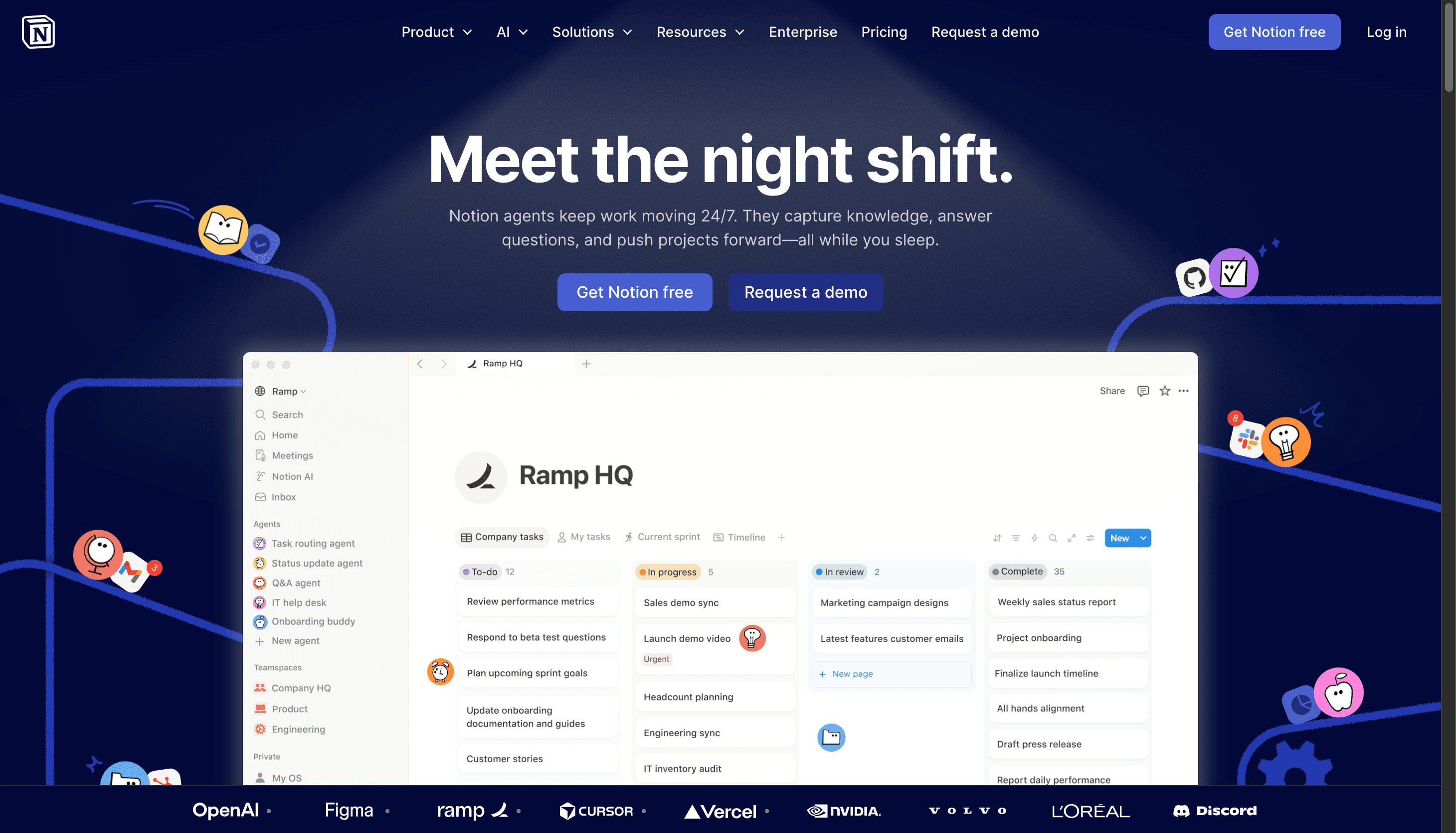
Notion's current homepage has made a sharp pivot. The hero is no longer "One workspace. Zero busywork." That was an old version. The current headline is "Meet the night shift." Dark navy background, AI agents doing work on your behalf while you sleep. The positioning is fully AI-first now.
But the proof architecture is still the master class, and it's gotten sharper.
The first scroll: The hero immediately shows real product UI, an actual Notion workspace with Ramp HQ's setup visible. Not an illustration. Not a mockup. A real team's real workspace. The message is immediate: this is what your workspace looks like when you actually use this.
The featured proof: Notion doesn't lead with a grid of logos. They lead with a full OpenAI customer callout. "There's power in a single platform where you can do all your work. Notion is that single place." Named company, named quote, high-authority reference. One strong proof beats ten weak ones.
The supporting layer: Below the OpenAI feature, a grid of smaller customer quotes from Vercel, Ramp, and others. Each one adds a data point without asking the reader to commit attention. Analytical buyers keep scrolling and find more; convinced buyers already converted pages ago.
The metric block: "More productivity. Fewer tools." followed by team size (10 people) and monthly savings ($340 and $4,080 in tool costs). Numbers with a before/after frame convert better than claims.
The pattern to steal: anchor your proof with one high-authority name, then stack supporting evidence below it. Notion doesn't ask you to believe a generic trust claim. They show you a real workspace, a real customer, a real dollar figure. Every element of proof answers a specific objection a visitor might have before they scroll away.
Loom: The Product IS the Demo
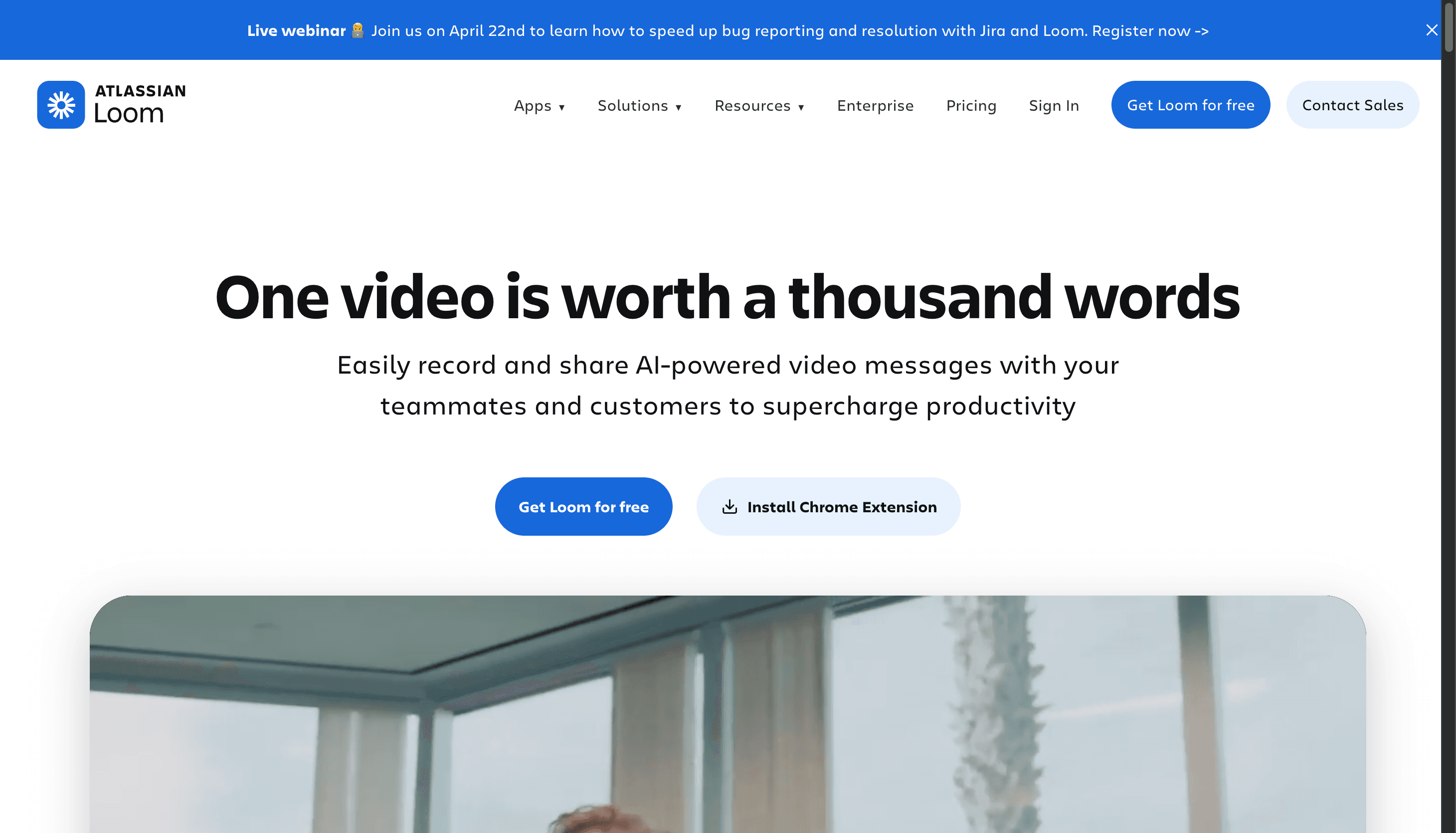
Loom's headline is "One video is worth a thousand words." Most SaaS sites would follow that with a description of the product. Loom follows it with the product.
Here's exactly what happens when you land on loom.com: a recording interface is already visible in the hero, active. A video is playing. Someone is recording their screen. You watch them record. You watch the share mechanic work. By the time you've read the headline, you've already understood the entire product loop, record, share, done, without Loom explaining a single word of it.
That's the difference between showing and telling.
Friction check: Free to start, single CTA in the hero, 400,000+ companies using it. And critically: no "watch a demo" button. No "book a call with our team." No modal. No gate. The product demonstrates itself, in real time, to every cold visitor who lands on the page.
The chat example further down the page makes the use case concrete in one sentence. A teammate asks: "Can you show me how to require two-factor authentication for my team?" The reply is a Loom link. That's it. The entire value proposition shown in a 2-message exchange. No feature list needed.
The pattern to steal: if your product does something visual, your homepage should show it doing that thing. Not describe it, not animate an abstract metaphor around it, not put it behind a "watch the demo" button that 80% of visitors won't click. Put the product in the hero, running, doing the thing it does. A visitor who watches your product work for 3 seconds is already halfway to signing up. A visitor who reads "AI-powered workflow automation" is still deciding whether to scroll.
If you need to explain what your product does before you can show it, that's a positioning problem, not a design problem. Solve the positioning first.
You Don't Need Notion's Budget to Use Notion's Playbook
Before we build anything, here's the objection I want to close: "These are massive companies. This doesn't apply to me."
Two examples that prove otherwise.
Wispr Flow (wisprflow.ai) is VC-backed but still a startup. Their headline: "Effortless Voice Dictation." Three words. Passes the clarity test immediately. Social proof: Reid Hoffman, the Clay team, named people with specific use cases rather than anonymous logo strips. Friction: free tier, download button visible in the hero. The 3-lever framework, executed cleanly at startup scale.
Superwhisper (superwhisper.com) is an indie product, bootstrapped. The social proof section leads with Andrej Karpathy, Pieter Levels, and Guillermo Rauch, names the target audience recognizes, alongside specific usage quotes ("I use it for literally every message I send"). Before/after voice demos live on the homepage, mirroring Loom's "show don't tell" approach. The free tier gives 15 minutes of recording, generous enough to remove the trial commitment entirely.
Same framework. Smaller teams. Smaller budgets.
You can build this this weekend with a $49 template. Here's how.
How to Build a High-Converting SaaS Site in Framer This Weekend
Phase 1: Foundation
Pick your template first. The template sets your conversion structure before you write a single word of copy.
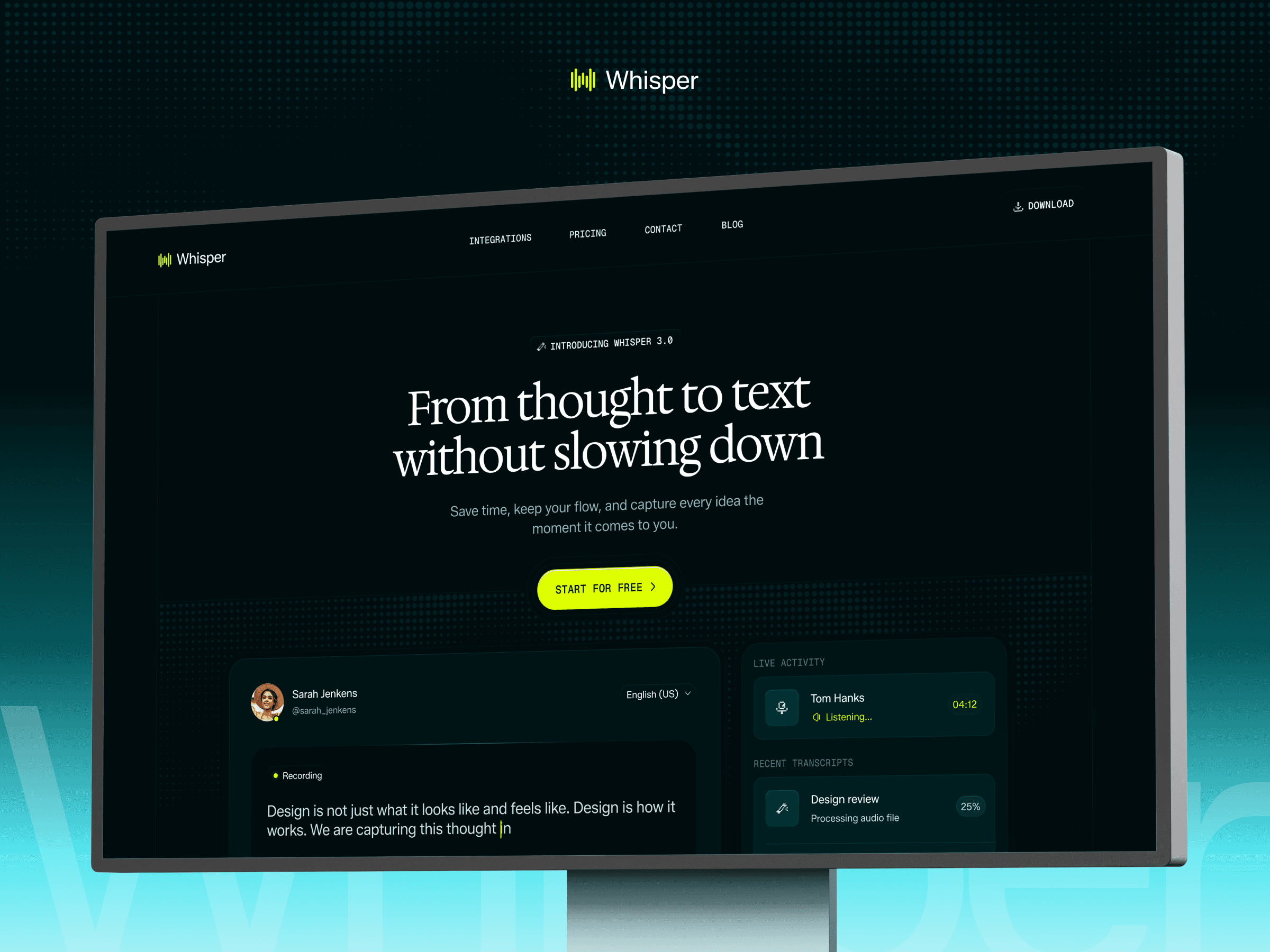
For a full SaaS marketing site with hero, social proof, features, integrations, pricing, and blog: Whisper is built for exactly this. It ships with the Linear clarity pattern already in place, a short headline block, single CTA, and proof bar immediately below the fold. Every section we just analyzed has a corresponding section in the template.
If you're earlier stage, validating an idea, and only need 4 or 5 pages before you're ready for a full content site: Melon is the lighter starting point. Outcome-led hero, clean proof section, ships with a Product Hunt launch banner for early social momentum. Same conversion structure, less surface area to customize.
Define your one-line value prop using the Linear clarity test. Can you describe what your product does in 6 words or fewer? Not what it is, what it does for the user. "Effortless Voice Dictation." "Turn voice into polished text." If you can't pass this test, don't open Framer yet. No template fixes a value prop problem.
Map your five pages. Home, Pricing, Integrations or Use Cases, Blog, Contact. That's the minimum viable SaaS site. Whisper ships with all five. Don't add pages beyond this before launch; more pages mean more decisions, and decisions slow you down.
Phase 2: Conversion Structure
Hero section: the Linear clarity pattern. Whisper's hero already has the right structure: headline block, subhead, single CTA, product visual. Your job is to swap in your 6-word value prop, set your CTA copy to match your one primary action, and drop in a real product screenshot. Resist the urge to add a second CTA. "Start free" and "Book a demo" in the same hero dilute both.
Social proof: the Notion and Superwhisper pattern. Whisper has testimonial sections built in. The mistake most founders make: they leave the stock testimonials in, plan to swap them later, and never do. Do this on Saturday. Reach out to your 3 earliest users. Ask one question: "How do you use this in your daily workflow?" Take their answer, cut it to 2 sentences, and get permission to quote them by name. Specific beats impressive, every time.
Feature sections: outcomes, not features. Every feature block has a heading and a description. The heading should state the outcome: "Save 3 hours a week" not "AI-powered transcription engine." Read each heading aloud. If it sounds like a spec sheet, rewrite it from the customer's perspective.
Pricing: visible, not buried. Whisper has a dedicated pricing page linked from the navigation. Make sure it's also accessible from the hero, a "See pricing" text link below the CTA button. Don't make prospects hunt for the number that determines whether they buy.
Phase 3: Polish and Launch
Mobile check: on a real phone, not Framer's preview. Send the staging URL to your phone, open it in Safari and Chrome, and scroll through every section. You're looking for text that's too small, CTAs that are hard to tap, and images that break the viewport. Fix these before publishing.
Performance: cut what isn't earning its place. Every animation that runs on page load is a tax on the first 5 seconds. If it doesn't directly show your product working, remove it. Compress hero images to under 200KB.
SEO basics: 20 minutes, not 20 hours. Set meta titles and descriptions for your homepage and pricing page, set a canonical URL, write custom OG images. That's the launch minimum. The full Framer SEO setup lives here: Framer SEO Guide.
Publish and ship. A live site that's 80% right beats a perfect site still sitting in Framer drafts. Iterate next weekend with real traffic data.
When to Use a Template vs. When to Go Custom
Factor | Template ($49 + weekend) | Custom ($5–15K + 6–8 weeks) |
Stage | Pre-PMF, MVP, validating | Post-PMF, $1M+ ARR |
Buyers | Self-serve, product-led | Enterprise, sales-led |
Team | Solo founder, small team | Has marketing or design hire |
Priority | Speed to market | Brand differentiation |
Most founders get this backwards. They spend $10K on a custom site before they have a single paying customer, then pivot the product six months later.
Your marketing site is not your product. Don't over-invest in the wrapper before you've proven the thing inside it.
For context on the platform decision itself, the Framer vs. Webflow guide covers the cost and capability tradeoffs directly.
5 SaaS Website Mistakes That Tank Conversions
These show up on almost every site I audit. All clarity problems, not design problems.
1. Clever headlines that don't communicate value. "Reimagine collaborative workflows" tells you nothing. "Project tracking for dev teams" tells you everything. Poetry loses to clarity, always.
2. Illustrations instead of product screenshots. If your homepage shows a cartoon of people high-fiving instead of your actual product interface, you're hiding something. If you don't have UI yet, a workflow diagram beats decorative illustration every time.
3. "Contact Sales" hiding your pricing at early stage. If your ACV is under $5K/year, show the price. Every click to request a quote is a self-serve conversion you're losing to a competitor who shows theirs.
4. Mobile as an afterthought. More than half of SaaS research traffic starts on mobile. If your CTA button is too small to tap on an iPhone, you're losing visitors before they read your headline.
5. Loading animations that eat the first 3 seconds. You have 5 seconds to answer "what is this." A 3-second loading animation eats 60% of that window before a single word of copy loads.
Conclusion
Linear, Notion, and Loom prove that clear structures with strong proof convert better than elaborate designs. Wispr Flow and Superwhisper prove the same patterns work at startup scale, with smaller teams and tighter budgets.
You don't need a design team. You need clarity about what you're selling, proof that it works, and a template that gets out of your way.
That's a weekend of work, not 8 weeks and $15K.
Whisper and Melon are both built around this exact conversion framework, starting at $49. Use code OMAKASE20 for 20% off. Or take every pattern in this guide and build your own. Either way, you have everything you need to ship this weekend.
FAQ
What makes a SaaS website high-converting?
Three things: clarity (visitor understands your product in under 5 seconds), proof (social proof visible before the first scroll), and low friction (primary action takes under 2 clicks). Design quality matters, but only after all three of these are handled first.
How much does a SaaS website cost to build?
The range is $49 with a Framer template and a weekend of work, to $5,000–$15,000 with a custom agency build over 6–8 weeks. For pre-PMF and early-stage SaaS, a template is the smart call. Invest in custom design after you've proven product-market fit.
Can I use a Framer template for a serious SaaS product?
Yes. Templates like Whisper ship with the same conversion structure used by companies like Linear and Notion: hero, social proof, feature sections, pricing, blog. You're customizing the content, not the conversion architecture.
What pages does a SaaS website need at minimum?
Five: Home (hero, proof, features, CTA), Pricing (transparent tiers), Use Cases or Integrations (proof of ecosystem fit), Blog (SEO and authority), and Contact. Everything else can wait until you have real traffic to justify building it.
How do I add social proof if I don't have customers yet?
More options than you think. A Product Hunt launch banner signals momentum without testimonials. Specific quotes from 3 beta users, even short ones, beat stock placeholders. Screenshots of positive DMs, community reactions, or early metrics ("processes 10,000 requests/day") all work. Never fake testimonials. It destroys trust the moment anyone notices.